Thursday 6 December 2012
Whilst researching for a task in my Narrative Illustration project I came across this web layout I liked. Just thought to note it down for future reference when I design my web page. Not sure on the bright colours - find them quite sickly to look at ! But I like the speech box that keeps recurring. How they have used it to back just one word looks interesting as well as how the colours are used reverse to each other (grey and white)


Wednesday 5 December 2012
This is a piece of work I developed up on the mac. I hand drew a pattern on the front cover of my Borough Market sketch book but had to refine it due to bad quality in lines. This was because the work had originally began as just a doodle and I had used the nearest pen to hand at the time - a chunky felt tip ! My thoughts on the final out come is that it is fresh and eye catching. Because of the green content - in both colour and subject matter - I was able to enter it in to the John Millest Show, Canterbury 2012.
Wednesday 28 November 2012
Today in class we learnt about the grid system in web layout. We were shown examples then created some of our own examples after. In using grids it keeps the page layout tidy and organised which looks professional and is easier on the viewer.
Once one was completed for the home page, I was able to work on an information page with the same grid. In using the grid it helped the website design layout to flow. My grid consisted of various segments but one important set of lines were a 10 pixel margin in top, bottom, left and right.
Wednesday 7 November 2012
In class I researched into File Formats. This was something I had little knowledge on so found my findings really helpful.
.JPG - this is a common file format that is used for images taken from a digital camera (vectors). When a JPG is saved it's data is compressed so the quality of the image decreases. Bellow is an example of a JPG file which has been used in my work before. although the quality is still very high, there is some decrease in the larger image...
TIFF - these are also file formats for images. However, they do not contain either text or vectors. They are used only for bitmap data. The TIFF file was one of the first formats available but is still very popular today. A TIFF file has a lot more information and a lot more memory space needed in comparison to a JPG file. Here is an example to show how a TIFF file's quality does not decrease when it's size increases...

.PNG - These files are designed for bitmap images. They were intended to be used to transfer images on the internet so are not up to the professional printing quality. What is different about a PNG file format is it allows the file to be saved with a transparent background. This is very useful and time effective as to get the same result, a clipping mask would have to be added onto the image in Photoshop.
.GIF - These are files which are unique as they can allow the user to compress files, make the background transparent (like a PNG), for interlacing and the ability to store more than one image per file to make an animation. GIF files are used for on the internet. Here is a link of an example of a GIF file sources from Wikipedia...
File:Rotating_earth_(large).gif
AI, IND and PDF - these are all applications brought out by Adobe. Although they all share a lot of the same features they are each used for specific design requirements.
AI - this is Adobe Illustrator. This is a drawing program that is used for vectors.
IND - this is Indesign. This program is more for document layouts. It is easy to combine images and text. Indesign is used in industry for designing magazine layouts.
PSD - This is a file format used for Photoshop. It allows layers to be saved which is a positive as it means work can be altered after the document has been closed. The down side to a PSD is that it contains a large amount of data. Here is an example of a PSD file that shows layers...

.PDF - is a file format which can be viewed, printed and electronically transmitted. It is a file that looks like a printed document but is in fact an image of text or text and graphics.
.JPG - this is a common file format that is used for images taken from a digital camera (vectors). When a JPG is saved it's data is compressed so the quality of the image decreases. Bellow is an example of a JPG file which has been used in my work before. although the quality is still very high, there is some decrease in the larger image...
TIFF - these are also file formats for images. However, they do not contain either text or vectors. They are used only for bitmap data. The TIFF file was one of the first formats available but is still very popular today. A TIFF file has a lot more information and a lot more memory space needed in comparison to a JPG file. Here is an example to show how a TIFF file's quality does not decrease when it's size increases...

.PNG - These files are designed for bitmap images. They were intended to be used to transfer images on the internet so are not up to the professional printing quality. What is different about a PNG file format is it allows the file to be saved with a transparent background. This is very useful and time effective as to get the same result, a clipping mask would have to be added onto the image in Photoshop.
.GIF - These are files which are unique as they can allow the user to compress files, make the background transparent (like a PNG), for interlacing and the ability to store more than one image per file to make an animation. GIF files are used for on the internet. Here is a link of an example of a GIF file sources from Wikipedia...
File:Rotating_earth_(large).gif
AI, IND and PDF - these are all applications brought out by Adobe. Although they all share a lot of the same features they are each used for specific design requirements.
AI - this is Adobe Illustrator. This is a drawing program that is used for vectors.
IND - this is Indesign. This program is more for document layouts. It is easy to combine images and text. Indesign is used in industry for designing magazine layouts.
PSD - This is a file format used for Photoshop. It allows layers to be saved which is a positive as it means work can be altered after the document has been closed. The down side to a PSD is that it contains a large amount of data. Here is an example of a PSD file that shows layers...

.PDF - is a file format which can be viewed, printed and electronically transmitted. It is a file that looks like a printed document but is in fact an image of text or text and graphics.
Wednesday 17 October 2012
web research
Soon, in class, I will be designing a web site for my self. My first step is to research in to existing web sites to help generate ideas as well as narrow down aspects I like and dislike. Here are the web sites I have looked in to and my thoughts on them...
This is Darren John's website. I find his artworks interesting but the layout is rather dull. The works are in two columns but seem a bit messy and hard to distinguish from one another as they are so close together and the white background blends in to the images - making it even harder to distinguish one from another.
http://www.adamdedman.co.uk
This is Adam Dedman's web site. I really like the layout of his home page; the thumb nail sized images sorted in to a grid looks professional. It is very easy on the eye and makes navigating around the site simply done. The plain white background gives a clean look and calms down the vibrance and business of the images. Another element of his site I liked is how the image's title rolls upwards in a text box ( the same width as the image it's self ) when scrolled over.
http://www.iamdarrenjohn.com
This is Darren John's website. I find his artworks interesting but the layout is rather dull. The works are in two columns but seem a bit messy and hard to distinguish from one another as they are so close together and the white background blends in to the images - making it even harder to distinguish one from another.
http://davebain.com
This is Dave Bain's web site. I really like how the fresh bright colours from his work sit on the plain white background. Having headings that are not created from type using the key board but by drawing it as an image adds more interest - e.g. 'New In'. My most liked feature to his site is how clips of Images have been shown in a long rectangular shape. This is more interesting than the conventional portrait rectangle which most images are designed to fit in.
http://jessicahische.is
This is the home page of Jessica Hische's web site. I really like how neat the layout is. All type is positioned in one left column and images are to the right. The home page has a grid of images that work really well. The images are of small close ups that open up to the larger full size version once clicked on. This is a clever way of portraying work as it allows you to select the best part of an image to show for a first impression.
Wednesday 10 October 2012
Today in class I have learnt how to create a button on a website. The program used was Flash. I began by opening a new document type - Action Script 2. Next, i drew a rectangle and chose the desired colour. All the tools in the toolbox where I found the 'Rectangle tool' are basically the same as ones I would find in programs I regularly use like Illustrator.
I then selected the rectangle. As I did this the shape changed to have a doted texture, this is a sign to verify that it is a vector. My following step was to click 'Modify' > 'Convert to Symbol' and a dialogue box appeared. As can be seen bellow, I renamed the symbol to button 1 and changed the type to 'Button'.
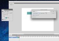 The next step I took was to re colour each state of the button.
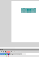
Here is the button's first state - UP. This is when the button is not in use but appears on screen.
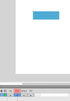
This is the button's second state - Over. What this is is when the cursor is rolled over the button.
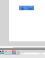
Here is the third state of the button - Down which implies when the curser is clicking on the button.

This is the button's fourth state - Hit. This is as the name for the area in which defines the button.
The document was then saved and tested to see if it worked. How this was done was by opening it by 'Command + Enter' and moving my curser over the button.
I then selected the rectangle. As I did this the shape changed to have a doted texture, this is a sign to verify that it is a vector. My following step was to click 'Modify' > 'Convert to Symbol' and a dialogue box appeared. As can be seen bellow, I renamed the symbol to button 1 and changed the type to 'Button'.
 The next step I took was to re colour each state of the button.
Here is the button's first state - UP. This is when the button is not in use but appears on screen.

This is the button's second state - Over. What this is is when the cursor is rolled over the button.

Here is the third state of the button - Down which implies when the curser is clicking on the button.

This is the button's fourth state - Hit. This is as the name for the area in which defines the button.
The document was then saved and tested to see if it worked. How this was done was by opening it by 'Command + Enter' and moving my curser over the button.
Wednesday 19 September 2012
Today I have had a lesson at collage on how to create a webpage. I found this quite challenging and a real head ache - but do feel that the more use to setting commands ect. I might eventually start to enjoy creating and designing webpages.
This is the out come of my very first attempt ...
Here is the webpage prior to any styling...
As you can clearly see it is very bland!
Here are the codes used which we set up on TextEdit. The screen grabs show the before and after of adding styles...
Codes that I used to firstly create the basics then improve the webpage's original look were as follows...
- <html>. This is the abbreviation for hypetext rmarkup language. The dictionary definition for html is "It isthe standard protocol for formatting and displaying documents onthe World Wide Web".
- <head>. This is the code for Heading.
- <h1>. This is the code for the first heading.
- <h2>. This is the code for the second heading and so on.
- <p>. This means paragraph.
- <a. This is the code for anchor.
- <img. Image is what this code means.
- href. This code means hypertext reference.
- <style>. this is the code for when wanting to style text and layout.
When beginning a command, e.g. when wanting to change the style, the code needs to be typed in with two surrounding chevrons like this... <style>. when the command is completely finished then chevrons are needed again but also a forward slash after the first chevron. example... </style>.
This is the out come of my very first attempt ...
Here is the webpage prior to any styling...
As you can clearly see it is very bland!
Here are the codes used which we set up on TextEdit. The screen grabs show the before and after of adding styles...
Codes that I used to firstly create the basics then improve the webpage's original look were as follows...
- <html>. This is the abbreviation for hypetext rmarkup language. The dictionary definition for html is "It isthe standard protocol for formatting and displaying documents onthe World Wide Web".
- <head>. This is the code for Heading.
- <body>. This is referring to the main bulk of text and image.
- <h2>. This is the code for the second heading and so on.
- <p>. This means paragraph.
- <a. This is the code for anchor.
- <img. Image is what this code means.
- href. This code means hypertext reference.
- <style>. this is the code for when wanting to style text and layout.
When beginning a command, e.g. when wanting to change the style, the code needs to be typed in with two surrounding chevrons like this... <style>. when the command is completely finished then chevrons are needed again but also a forward slash after the first chevron. example... </style>.
Thursday 13 September 2012
I am rather proud of this little poster...
I designed it for the Peace One Day campaign as a task that was set in class. The image was hand drawn using fine liner then coloured up on Illustrator. I am really happy with the out come as it shows off my style well. The block colour gives a simple look which is effective against the detailed drawings. The colours I feel relate to peace strongly but also sit upon one another well.
Wednesday 12 September 2012
Another artist I really admire is Vicky Newman...
Her work varies in medium but continue to have the same clean elegant look. She is great drawing by hand and makes her work beautiful with romantic detail which often gives her work flowing movement. The use of monochrome give her work a bold statement look even on a light, delicate piece. Vicky Newman's work can often be dream like and feminine with a lot of pieces incorporating beautiful women.


Only myself recently hearing off, here is work from Julia Rothman...
My view is that we both have a similar drawing style. I like creating images using black fine liner and feel this gives me the control to add detail which is an element that can always be seen in Julia Rothman's pieces. Her work is elegant and delecate which i would see to be more female appealing. The bulk of her work does seem to be very feminine in colour but also subject matter - using homely objects or animals and birds. She also produces lots of beautiful patterns that keep the eye moving all round due to it's busyness. Colour is only used in blocks in her work which i feel balances out the heavy amount of detail in the image well.

My view is that we both have a similar drawing style. I like creating images using black fine liner and feel this gives me the control to add detail which is an element that can always be seen in Julia Rothman's pieces. Her work is elegant and delecate which i would see to be more female appealing. The bulk of her work does seem to be very feminine in colour but also subject matter - using homely objects or animals and birds. She also produces lots of beautiful patterns that keep the eye moving all round due to it's busyness. Colour is only used in blocks in her work which i feel balances out the heavy amount of detail in the image well.

We have been set the fairly simple task of finding what options are out there for us after we finish this Graphic Design course. However, I am having difficulties choosing what direction I want to work towards. Not having explored all areas on this course yet I do not know if perhaps it could be some thing like web design which could be what I am best in. But I am edging towards illustration or advertising the most. I know of the HND course in Canterbury but feel this is 'a safe option'. Reason being it is still in an area I am familiar with and close to home. Looking around at Universities further afield seems very daunting but I know I would need to make that life changing step if I want to broaden my options in further education.
Wednesday 5 September 2012
Back to collage post
Over the summer i have been relatively busy which resulted in leaving my iPod untouched for a good part of a month. But in the limited time spent ignoring my surrounding to focus on music I did find a couple of really worth while albums. They come from the band Little comets - In Search Of Elusive Little Comets then Worry. All though I may have descovered this album slightly late on, the first album mentioned was released a year ago, they are both full of well constructed lyrics and beats that work harmoniously with the lead singers rustic voice. I was also interested with the albums covers...


Rough and grungy is how I would describe the two pieces which does relate to the albums lyrical content well. In a way the look is naive but this gives it so much character and interest. I like the contrast in textures and areas of detail in the album Worry's cover. The cover is defiantly something that drew me in and hopefully an element that will help Little Comets become more known as their work really deserves more recognition! From brief research I believe the cover was designed by the band themselves.


Rough and grungy is how I would describe the two pieces which does relate to the albums lyrical content well. In a way the look is naive but this gives it so much character and interest. I like the contrast in textures and areas of detail in the album Worry's cover. The cover is defiantly something that drew me in and hopefully an element that will help Little Comets become more known as their work really deserves more recognition! From brief research I believe the cover was designed by the band themselves.
Thursday 5 July 2012
My name is Vicky Crouch and at this moment in time I am Art&Graphic Design student at Canterbury Collage. This being the main reason to why I have began blogging. I will from now on use this site to display my art work. I am hoping that Blogger will enable to inspire me through others work but also a great way to look back on my own.
Subscribe to:
Posts (Atom)
