
Tuesday 9 July 2013
Here is my final net design which I produced as part of my Packaging project. The design was for the Boots brand Natural Collection. I decided to design a card box for the purpose of containing a Natural Collection Eyeshadow. The official design for this brand is very clean and minimal - but also very boring. I wanted to create a design the reflected the 'natural' part to the brand but one that prevented the product from being over looked when shelved. I think I have met this brief successful and feel it is very suited to the brands female target audience. This would be through both the colour pallet used and the feminine graphics. The curved shape of the net when constructed also relates to the female target audience.


Monday 1 July 2013
web
Here is the designs for a simple website i created using WIX. I found the site really easy to use and good for really personalising the web site look because it had so many design choices. On the home page is a logo design I created to promote myself. I feel it is successful as it is very eye catching because of the repeated lines in a circular motion.


Thursday 6 June 2013
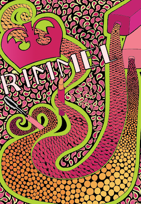
These are my favourite poster designs from my Retro Poster project. For the project I decided to produce outcomes for Rimmel London products. This was my most enjoyed project as it really allowed me to experiment with with movement and energy in shape and colour.

This poster was created in the style of Hundertwasser. I then developed it digitally adding a colour scheme which gradually progressed into the psychedelic style.

This poster is in a Psychedelic style.

This poster was created in the style of Hundertwasser. I then developed it digitally adding a colour scheme which gradually progressed into the psychedelic style.

Russian propaganda was the influence for this poster. I like how power and femininity are both portrayed in the poster as this suites the brand well.

In my magazine project I found a photograph that I digitally edited. I did this by drawing over the image using a Wacom Tablet. It was my first time in using one and although it took a bit of getting used to, I enjoyed using it. I could develop the design more by adding type to give it some form of purpose.


From my type project I found these designs...
My hand drawn book cover design which was digitally edited. We designed covers for Type related books and I chose Hand Made Type by Charlotte Rivers.

And, an alphabet design using cupcake cases. I gave my self strict constraints with the designing of each letter which made some letters slightly obscure. I only allowed one case per letter and this could only be folded - not at all cut.


Here are two poster designs I created during our advertising project. Within this project we had to promote Borough Market to the local community. The idea was to persuade them to shop locally at Borough instead of the supermarkets in the area. I also went on to design some apparel. I really liked this project as I could design using a really organic theme which I had not done before.


This is a design I created recently. After looking back at my first project, for the reason of creating a portfolio, I was inspired by two artists I had researched in to - Claire Coles and William Morris. I decided to create a segment of design suitable for a traditional wallpaper like William Morris's work in the Arts and Crafts movement. I wanted to combine a beautiful pattern within this like how Claire Coles does with patterned fabric.
I created this from a hand drawn image which i then edited digitally. Using Illustrator I was able to add colour and the floral pattern.
Tuesday 4 June 2013
For my narrative project we were set a brief to create designs for a book suitable for children. I chose to illustrate Charlie and the Chocolate Factory. I chose to work in a style heavily influenced by Lauren Child as she is known for her unique children's books, which she both writes and illustrates.


Wednesday 24 April 2013
In december, I posted about a nautical pattern I had created. I decided to enter it in to the Page Turner 2013 competition. The theme the work had to be related to was Curiosity. I thought that my design suited this as of the interesting shapes the ropes create which draw the eye around the page and make the design look curious. I made some developments to the design by adding a title - Curious Knot. I placed this in the centre as I felt this area looked quite bare. I was lucky enough to be short listed for the awards evening, held at UCA, but came away with first place for my age category. I am frilled and so excited to see it at the Turner Contemporary soon.


Subscribe to:
Posts (Atom)